")
")
frontpage(en)
 |
 |
|||
 |
 |
|||
 |
 |
 |
 |
 |
|
|
|||
|
|
|||
|
|
|
|
|
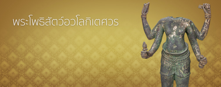
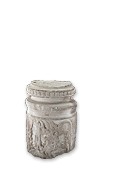
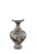
พิพิธภัณฑสถานแห่งชาติ สุรินทร์ เกิดขึ้นมาจากประชาชนและข้าราชการได้นำโบราณวัตถุศิลปวัตถุมาบริจาคและจัด แสดงไว้ที่ศาลากลางจังหวัดเมื่อราว พ.ศ. 2517 หลังจากนั้นย้ายไปเก็บรักษาและจัดแสดงที่อาคารสำนักงานศึกษาธิการจังหวัด สุรินทร์
พิพิธภัณฑสถานแห่งชาติ สุรินทร์ เกิดขึ้นมาจากประชาชนและข้าราชการได้นำโบราณวัตถุศิลปวัตถุมาบริจาคและจัด แสดงไว้ที่ศาลากลางจังหวัด
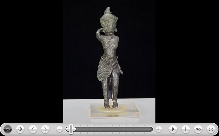 เมื่อราว พ.ศ. ๒๕๑๗ หลังจากนั้นย้ายไปเก็บรักษาและจัดแสดงที่อาคารสำนักงานศึกษาธิการจังหวัด สุรินทร์ ต่อมาเมื่อได้รับมอบโบราณวัตถุ ศิลปวัตถุเพิ่มมากขึ้น ทั้งจากประชาชน และจากการดำเนินการทางโบราณคดี ทำให้สถานที่จัดแสดงชั่วคราวคับแคบ ไม่เหมาะสมต่อการให้บริการ....
The Widgetkit Slideset takes your product showcase to the next level. It provides a sleek way to show multiple sets of items and uses smooth effects while looping through them.
The sets are auto generated (4 items per set), item names are shown and it uses the slide effect and navigation buttons.


The sets are arranged manually, the sets names are used as navigation and it uses the zoom effect.


The sets show the item names and it uses the drops effect and navigation buttons.


This auto generated sets uses prev/next buttons as navigation and the deck effect.
The Widgetkit Slideset takes full advantage of the very user-friendly Widgetkit administration user interface. You can create and manage all the slidesets and their different items in one place. After you have created a slideset you can load it anywhere on your website using shortcodes or the universal Widgetkit Joomla module or WordPress widget.
The Widgetkit Accordion enables you to display a set of items in a compact space, by clicking on each items header it expands or collapses it's content section.

Lorem ipsum dolor sit amet, consectetur adipisicing elit, sed do eiusmod tempor incididunt ut labore et dolore magna aliqua.
Lorem ipsum dolor sit amet, consectetur adipisicing elit, sed do eiusmod tempor incididunt ut labore et dolore magna aliqua.

Lorem ipsum dolor sit amet, consectetur adipisicing elit, sed do eiusmod tempor incididunt ut labore et dolore magna aliqua.
Lorem ipsum dolor sit amet, consectetur adipisicing elit, sed do eiusmod tempor incididunt ut labore et dolore magna aliqua.
The Widgetkit Accordion lets you easily create and manage all the accordions contents through the user-friendly Widgetkit administration user interface. After you have created an accordion you can load it anywhere on your website using shortcodes or the universal Widgetkit Joomla module or WordPress widget.
The Widgetkit Map provides a simple solution for adding a map to your website. Various features let you customize the map like changing colors and adding markers or directions.
This map features all map controls, multiple markers and you can get the direction.
Set or invert the hue, saturation, lightness and gamma of a map.
This map has a fixed width, no controls and no markers.
With the Widgetkit Map you can quickly create and manage simple maps with features like multiple markers, text popups and custom color schemes. Once you have created a map you can load it anywhere on your website using shortcodes or the universal Widgetkit Joomla module or WordPress widget.
The Widgetkit Gallery provides a smart and automated way to publish images on your website. You only need to select the image folders and the whole gallery is generated automatically.
This is an image showcase with eye-catching transition effects and a thumbnail navigation.
This is an image wall with zoom effect, no margins and squared corners using the lightbox.


This is an image wall with scattered polaroid pictures using the lightbox.
This is an image slider where the image centers automatically during the effect. It also features a spotlight caption and the lightbox.
This is an image slider where the image stays left during the effect.
This is an image gallery using the nice swipe effect from the slideshow widget.


This is an image gallery using all the features from the slideshow widget.
This is a simple image showcase mashing up all the features from the slideshow and slideset widget.
This is an image wall with some margins and rounded corners using the spotlight and lightbox.


This is an image gallery using all the features from the slideset widget.


The Widgetkit Gallery comes with a user-friendly administration user interface which let's you create new galleries with just a few clicks. The integrated directory browser let's you easily add or remove source directories of your images. All galleries can be loaded anywhere in your theme using shortcodes or the universal Widgetkit Joomla module or WordPress widget.
The Widgetkit Media Player is a HTML5 audio and video player completely built HTML and CSS. You can easily embed video files into your website by using the HTML5 video element. A Flash player fallback is included for all unsupported browsers.
This is a MP3 Audio Sample:
Use the HTML5 video element to embed video in your website. For example:
<video src="/video.mp4" width="320" height="240"></video>
You can also provide multiple sources, to add support for the different video formats like h.264, WebM or Ogg:
<video width="320" height="240">
	<source type="video/mp4"  src="/video.mp4" />
	<source type="video/webm" src="/video.webm" />
	<source type="video/ogg"  src="/video.ogv" />
</video>
Use the HTML5 audio element to embed MP3 files in your website. For example:
<audio src="/audio.mp3" type="audio/mp3"></audio>
The Widgetkit Twitter module is the neatest way to display tweets directly on your website. All displayed tweets get cached so they show up super fast, even if Twitter is not available.
Create a Twitter module in Joomla or a Twitter widget in WordPress and publish it in a module position. A lot of options are available to choose which tweets you want to show.
For example you can show only tweets from a specific user or tweets that contain a certain hash-tag or a specific word. All options can be combined. To filter by more than one word or user use a space between them. For example: yootheme joomla.
The Widgetkit Spotlight allows you to add an overlay to your images which fades or moves in on mouse hover. The overlay can be an image or HTML content. The default magnifier spotlight is a perfect match to be used with a lightbox.
If no custom overlay is set the default spotlight fades in an overlay with an magnifier image. If you define a custom overlay you can choose between different animations - fade, bottom, top, right and left.
Use the HTML5 custom data attribute data-spotlight to activate the spotlight.
<a data-spotlight="on" href="/mypage.html">
	<img src="/image.jpg" width="180" height="120" alt="" />
</a>
To create a custom overlay use a div element with the CSS class overlay. You can set the effect parameter to the data attribute. For example:
<a data-spotlight="effect:bottom;" href="/mypage.html">
	<img src="/image.jpg" width="180" height="120" alt="" />
	<div class="overlay">Custom Overlay</div>
</a>
You can set the effect parameter to fade, bottom, top, right and left.
The Widgetkit Lightbox allows you to view images, HTML and multi-media content on a dark dimmed overlay without having to leave the current page.
Different animations - fade, elastic and none


Different title positions - float, inside and over


Various examples in one gallery (try also using the keyboard and mouse scroll wheel)
Use #wk-ID to load widgets like slideshows or galleries in a lightbox. For example: Widgetkit Slideshow
<a data-lightbox="width:600;height:300;" href="#wk-10">Lightbox</a>
Use the HTML5 custom data attribute data-lightbox to activate the lightbox. You can set various lightbox parameters to the data attribute. For example:
<a data-lightbox="width:1000;height:600;" href="http://www.wikipedia.org">Lightbox</a>
Here is a list of the most common parameters:
float, outside, inside or over)fade, elastic, or none)fade, elastic, or none)true or falseyes or noThe Widgetkit Slideshow is the ultimate image and content slideshow for Joomla and WordPress. It's flexible, easy to customize and completely build with HTML5 and CSS3.
This is an image slideshow with the famous Ken Burns effect.
This is an image slideshow with eye-catching transition effects.
This a content showcase using all the features from the Slideset widget as navigation. Any kind of HTML content can be used in the navigation.
Lorem ipsum dolor sit amet, consectetur adipisicing elit, sed do eiusmod tempor incididunt ut labore et dolore magna aliqua.
Lorem ipsum dolor sit amet, consectetur adipisicing.
Read more
Lorem ipsum dolor sit amet, consectetur adipisicing elit, sed do eiusmod tempor incididunt ut labore et dolore magna aliqua.
Lorem ipsum dolor sit amet, consectetur adipisicing.
Read more
Lorem ipsum dolor sit amet, consectetur adipisicing elit, sed do eiusmod tempor incididunt ut labore et dolore magna aliqua.
Lorem ipsum dolor sit amet, consectetur adipisicing.
Read more
Lorem ipsum dolor sit amet, consectetur adipisicing elit, sed do eiusmod tempor incididunt ut labore et dolore magna aliqua.
Lorem ipsum dolor sit amet, consectetur adipisicing.
Read more
Lorem ipsum dolor sit amet, consectetur adipisicing elit, sed do eiusmod tempor incididunt ut labore et dolore magna aliqua.
Lorem ipsum dolor sit amet, consectetur adipisicing.
Read more
Lorem ipsum dolor sit amet, consectetur adipisicing elit, sed do eiusmod tempor incididunt ut labore et dolore magna aliqua.
Lorem ipsum dolor sit amet, consectetur adipisicing.
Read more
Lorem ipsum dolor sit amet, consectetur adipisicing elit, sed do eiusmod tempor incididunt ut labore et dolore magna aliqua.
Lorem ipsum dolor sit amet, consectetur adipisicing.
Read more
Lorem ipsum dolor sit amet, consectetur adipisicing elit, sed do eiusmod tempor incididunt ut labore et dolore magna aliqua.
Lorem ipsum dolor sit amet, consectetur adipisicing.
Read more Item 1
 Item 2
 Item 3
 Item 4
 Item 5
 Item 6
 Item 7
 Item 8
This is an image slideshow with some nice navigation buttons. You can place any kind of HTML in the navigation buttons.


 Item 1 Item 2 Item 3 Item 4
This is a classic, tabbed slideshow. Tabs can be aligned to the left, right and center.
Lorem ipsum dolor sit amet, consectetur adipisicing elit, sed do eiusmod tempor incididunt ut labore et dolore magna aliqua.
Lorem ipsum dolor sit amet, consectetur adipisicing elit, sed do eiusmod tempor incididunt ut labore et dolore magna aliqua.
Lorem ipsum dolor sit amet, consectetur adipisicing elit, sed do eiusmod tempor incididunt ut labore et dolore magna aliqua.
This is a slideshow with a tabbed navigation bar. Tabs can be aligned to the left, right and center.
Lorem ipsum dolor sit amet, consectetur adipisicing elit, sed do eiusmod tempor incididunt ut labore et dolore magna aliqua.
Lorem ipsum dolor sit amet, consectetur adipisicing elit, sed do eiusmod tempor incididunt ut labore et dolore magna aliqua.
Lorem ipsum dolor sit amet, consectetur adipisicing elit, sed do eiusmod tempor incididunt ut labore et dolore magna aliqua.
This is a slideshow with a vertical tabbed list as navigation.
Lorem ipsum dolor sit amet, consectetur adipisicing elit, sed do eiusmod tempor incididunt ut labore et dolore magna aliqua.
Lorem ipsum dolor sit amet, consectetur adipisicing elit, sed do eiusmod tempor incididunt ut labore et dolore magna aliqua.
Lorem ipsum dolor sit amet, consectetur adipisicing elit, sed do eiusmod tempor incididunt ut labore et dolore magna aliqua.
Lorem ipsum dolor sit amet, consectetur adipisicing elit, sed do eiusmod tempor incididunt ut labore et dolore magna aliqua.
Lorem ipsum dolor sit amet, consectetur adipisicing elit, sed do eiusmod tempor incididunt ut labore et dolore magna aliqua.
Lorem ipsum dolor sit amet, consectetur adipisicing elit, sed do eiusmod tempor incididunt ut labore et dolore magna aliqua.
The Widgetkit Slideshow takes full advantage of the very user-friendly Widgetkit administration user interface. It has never been easier to create and manage all the slideshows and their different slides in one place. After you created a slideshow you can load it anywhere in your theme using shortcodes or the universal Widgetkit Joomla module or WordPress widget.
Widgetkit is the next generation tool set for Joomla and WordPress. This toolkit is the first of its kind! It provides a simple and user-friendly way to enrich your websites experience with slideshows, galleries, lightboxes and much more. All widgets make use of modern web technologies like HTML5 markup, CSS3 features and jQuery based JavaScripts. Widgetkit is fully responsive and all widgets and their effects adapt perfectly for all device resolutions. It supports touch gestures and makes use of smooth CSS3 animations. Here is a short feature roundup:
Widgetkit basically acts as a platform for all our widgets. It installs as a single component in Joomla or as a plugin in WordPress. The Widgetkit dashboard presents you an overview of all widgets. You can create, edit or delete all widgets and their content in one place. And after you have created the content for your first widget you can either use a shortcode or a module to display your widget anywhere on your website. In fact you can do both because once have you created a widget you are able to display it multiple times and reuse it on different parts of your website.
Visit WebsiteThis theme comes with different module styles, badges and icons. For each module you can pick a style and combine it with an icon or badge to create your own unique look. Here is a list of the available options:
| Styles | Box |
| Badges | Hot, New, Free, Top |
| Icons | Download, Twitter, Mail, Bubble, Login, Cart |
YOOtheme is a well-known template and extension provider for Joomla and WordPress who helps you to create professional websites. But to make your website or interface design a real eye-catcher we had one thing missing: Icons! Icons are an essential tool to simplify user interfaces and today almost every major website uses icons to highlight important parts in their content.
This is why we created a great resource of beautiful and handcrafted icons for web and print projects. We got commercial icon sets including e-commerce, community, file and folder icons and many more as well as many freebies.
As a member of our icon club you will get access to hundreds of handcrafted and detailed icons. New icon sets are added continuously!

ZOO is a flexible and powerful content application builder to manage your content. It provides a much improved Joomla experience. The key feature is the ability to create your very own custom content types. You define what a type is made up of - e.g. text, images or a file download. Any combination is imaginable! You bring the content, ZOO brings the elements to structure it and make it look good!
ZOO moves from simply being a CCK to an Application Builder. Apps are extensions for ZOO which are optimized for different purposes and types of content catalogs. ZOO offers a wide range of apps to get you started right away. There is a blog, a product catalog, a cookbook, a business directory, a documentation, a download archive and a movie database app!

By now ZOO has developed a thriving ecosystem, with new ZOO extensions appearing regularly. It also integrates well with many popular Joomla extensions. Besides the ZOO component itself offers additional modules and plugins. They allow a seamless integration into Joomla and provide a richer tool set to create your website.
Visit WebsiteYou can create some beautiful content by using some simple HTML elements. The Warp theme framework offers some neat styles for all HTML elements and a great set of CSS classes to style your content. Basic HTML is very easy to learn and this small guide shows you how to use all styles provided by the Warp framework.
Here is a short demonstration of text-level semanticts. The <p> element creates a new paragraph. It will have some space before and after itself. To turn your text into hypertext just use the <a> element.
You can emphasize text using the <em> element or to imply any extra importance the <strong> element. Highlight text with no semantic meaning using the <mark> element. Markup document changes like inserted or deleted text with the <del> element or <ins> element. To define an abbreviation use the <abbr> element and to define a definition term use the <dfn> element.
Inline quotations can be defined by using the <q> element
.
The <blockquote> element defines a long quotation which also creates a new block by inserting white space before and after the blockquote element.
To define a short inline computer code use the <code> element. For a larger code snippet use the <pre> element which defines preformatted text. It creates a new text block which preserves both spaces and line breaks.
pre {
    margin: 15px 0;
    padding: 10px;
    font-family: "Courier New", Courier, monospace;
    font-size: 12px;
    line-height: 18px;
    white-space: pre-wrap;
}
Use the <small> element for side comments and small print.
Here is a short demonstration of all style related CSS classes provided by the Warp framework.
Drop caps are the first letter of a paragraph which are displayed bigger than the rest of the text. You can create a drop cap using the CSS class dropcap. To emphasize text with some small boxes use <em> element with the CSS class box.
box-content.box-note.box-info.box-warning.box-hint.box-download.Use the CSS class dotted to create a dotted horizontal rule.
Create a zebra stripped table using using the CSS class zebra.
| Table Heading | Table Heading | Table Heading |
|---|---|---|
| Table Footer | Table Footer | Table Footer |
| Table Data | Table Data | Data Centered |
| Data Bold | Table Data | Data Centered |
| Table Data | Table Data | Data Centered |
Create a nice looking definition list separated with a line by using the CSS class separator.
Create a clearly arranged form layout with fieldset boxes using the CSS class box.
This theme utilizes the latest features of the fast and slick Warp theme framework. It comes with a broad range of layout and module variations as well as a neat typography to style your content. Read on to learn more about this theme and its features:
We provide different style variations of the default theme. In addition to these styles we added several other style settings like colors and fonts. Combining the different style options allows you to create your own unique theme design.
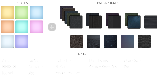
We created some nice theme profiles using the different styles, colors and fonts, you can choose from in the theme administration. You can create your own profiles and even assign them to different menu items. Click on one of the profile images to load it.
This theme comes with the default Warp6 module layout. The blue module positions allow to choose a module layout which defines the module alignment and proportions: equal, double or stack. You can easily add your own module layouts. The two available sidebars, highlighted in red, can be switched to the left or right side and their widths can easily be set in the theme administration. For modules in the blue and red positions you can choose different module styles. Take a look at the module variations page to get an overview.


The Drive theme comes with some additional features.
We created some custom styles for our Widgetkit Slideshow and Widgetkit Slideset, perfectly fitting to the theme. To apply this styles, follow these steps:
As a little extra, the Drive theme offers a set of social icons. They are easy to add to your content and are part of our editable Adobe Fireworks Image Source Files.
Here is a little code example how to add them:
<ul class="social-icons">
	<li class="twitter"><a href="#"></a></li>
	<li class="facebook"><a href="#"></a></li>
	<li class="vimeo"><a href="#"></a></li>
</ul>
Possible class names are twitter, facebook, vimeo and rss.

พิพิธภัณฑสถานแห่งชาติ สุรินทร์ เกิดขึ้นมาจากประชาชนและข้าราชการได้นำโบราณวัตถุศิลปวัตถุมาบริจาคและจัดแสดงไว้ที่ศาลากลางจังหวัดเมื่อราว พ.ศ. ๒๕๑๗ หลังจากนั้นย้ายไปเก็บรักษาและจัดแสดงที่อาคารสำนักงานศึกษาธิการจังหวัดสุรินทร์ ต่อมาเมื่อได้รับมอบโบราณวัตถุ ศิลปวัตถุเพิ่มมากขึ้น ทั้งจากประชาชน และจากการดำเนินการทางโบราณคดี ทำให้สถานที่จัดแสดงชั่วคราวคับแคบ ไม่เหมาะสมต่อการให้บริการ....


